Monday, December 12, 2016

Week 15B

During class I added in a few photos to my page. I started out with all the same photo just to make sure the layout worked and then I was going to go ahead and change them.

To get the images to fit where I wanted them and become the right sized circle, I had to re-size each one in photoshop first.


As you can see they are all added in. Each circle looks a little different even though each picture is just about the same size. They are all just slightly different but if I were to resize them to all the same size, a few would looked distorted.


I was also able to center the arrows in the "How" section of my page. I wanted them in there to section off the different steps of the process but didn't want it to seem too literal.


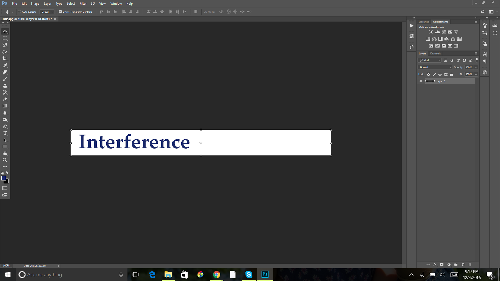
I then started working on a header. I honestly did not know what to do for this part. I tried different fonts and word placement but could not find anything I really liked or thought worked so I put it off for a little bit more.


However, I did put it into the code just to see what it looked like and just in case I could not think of anything else.


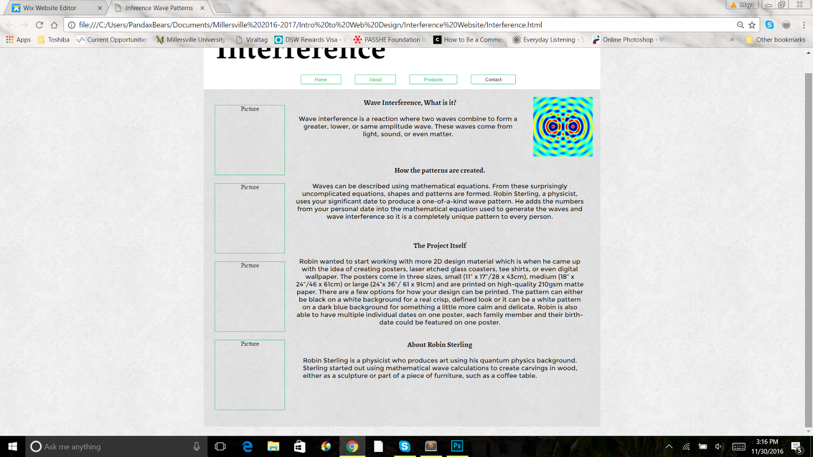
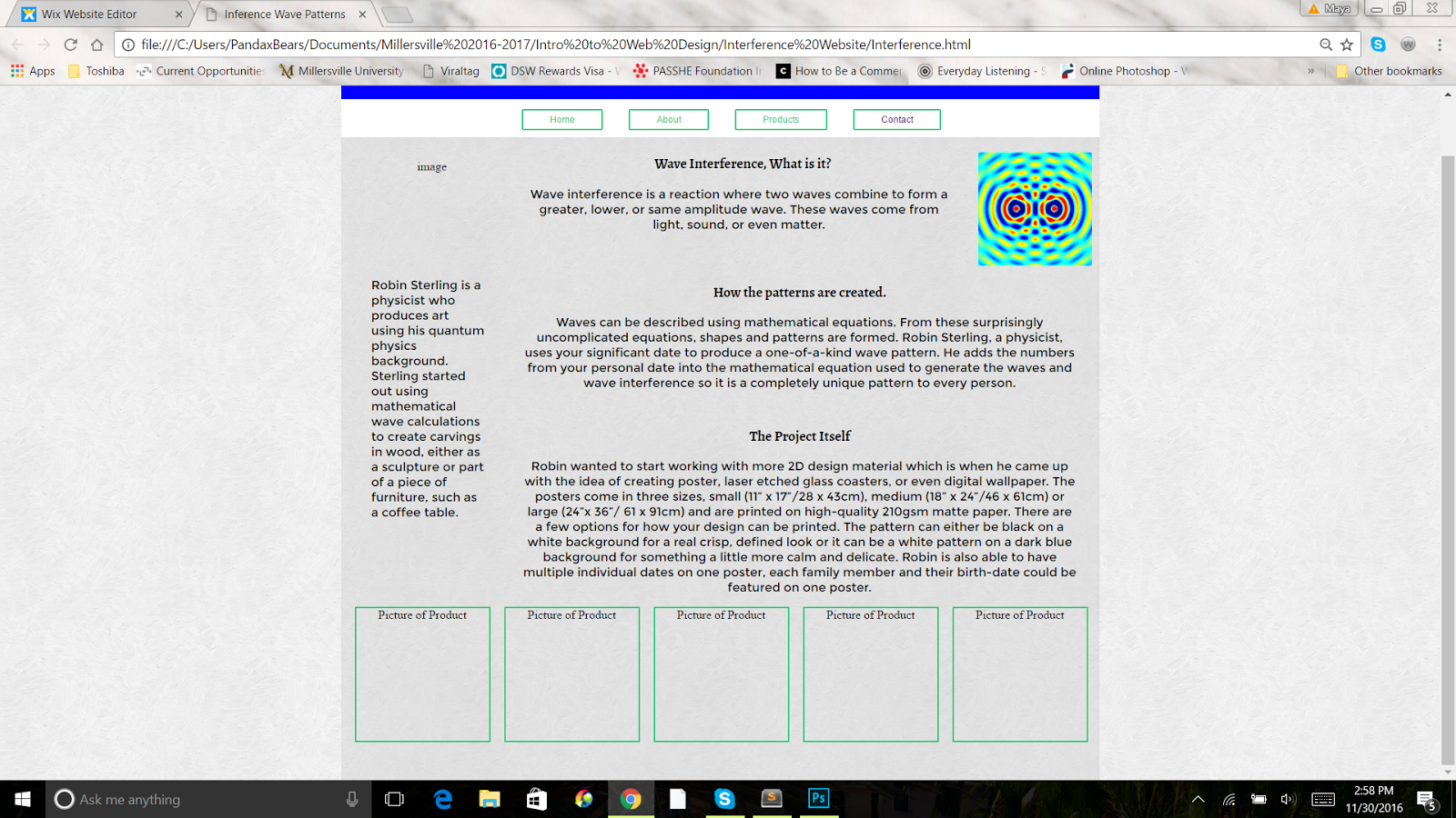
Here is what the page looks like as a whole at this point (minus the four photos on the bottom, those were changed).


Thursday, December 8, 2016

Week 15A

Today in class we had an in progress critique. At first a few of us volunteered to show what we had done in front of the class, I decided to show what I had so far.


Most of the class said to go with a more organic feel to the layout of my design since the patterns Robin creates have a very natural feel to them. At first I wanted to go with a very straight forward, technical feel to my design since the patterns are based on a mathematical equation, something straight forward and technical. But I understood what the class meant about switching gears.


After splitting into groups and critiquing everyones' work we had the rest of the class to work on our designs. I changed everything in both my html and css to a comment and started from scratch, more or less. I kept the same background and started redoing my layout.


For the one section I have on my web page that describes the process on how the patterns are created I decided to create little arrows to put in with the text.
Here's how they looked at first, I plan on going in and centering them:

Basically starting all over and having very little information is going to be a challenge for me but I am going to work hard. Designing my webpage is the toughest part for me but putting all into code is so fun and is my favorite part of the entire process.

Sunday, December 4, 2016

Week 14: Outside the Classroom

Over the weekend while working on my webpage I decided to make one on the tabs on my nav bar work, taking you to a page with contact information. I have the page set up so the link works I just need to format that one and add in the information. I also decided to rearrange things and place the photos of the products along the side of the page. First I got the general layout:

Next I broke up each photo. They most likely will not stay that size and I though about alternating them along side the paragraphs.

 I also worked on centering everything and I changed the body text by giving it a different color, the dark blue on my style tile. I am currently working a header.

I was stuck for awhile as far as the header.

I wanted something simple but interesting so I thought I'd add an image with a gradient affect which I created in Photoshop.


I checked out what it looks like on my page and I still feel I have to tweak it a bit but I feel like I am on the right track


I also added in some photos of the different products along the side of the website.


Week 14B

Today in class Professor Pannafino was unable to make it but we still needed to take the time to work on our webpage. Before class I had a general layout planned of how I was going to include my content so I started adding in text to start:


I tried out different fonts and line heights:


And I finally picked one out that I liked and added in an image to go with the first paragraph. The only thing that had been bothering me was the first title was off centered with the rest, so that needed to be fixed.


Tuesday, November 29, 2016

Week 14A

Today in class Professor Pannafino briefly went over html coding with us, just as a refresher. We also talked about the reading a little and signed up to meet with him either today or Wednesday. I signed up fro Wednesday.

We then had the rest of the class to work on our website. At the beginning of class this is what my site looked like:


I started out working on the basic structure of the site and as I finish that I will start adding the details.

The full horizontal design was giving me a bit of trouble so I restarted and created a "page" over top a background kind of layout again but all of my content will be laid out in a horizontal fashion to give the appearance of a full horizontal design.


Right now I am keeping each section a primary color so I remember where each section begins, as I go on I will add the final background in.


I sized the header how I want it and then started working on a fake navigation bar. the buttons on here will most likely not go anywhere, I am just adding them in for aesthetic.


After working on it a bit, I have everything laid out(or at least an idea of a layout) as far as the content is concerned. I still need to work on the header, not 100% sure what I am going to do with it yet.

Monday, November 28, 2016

Week 13 Outside the Classroom

Over the weekend I started working on the layout of my webpage. I started building a horizontal layout for my webpage and added background colors. I cant seem to remember how to get rid of the extra space at the very top but other than that everything is working well. Here is what I have so far:


One thing I also need to work on is placing an image as a background. The blue at the top and bottom is actually an image. I dont mind the way it looks now but I want to be able to see the whole image.

The back background is scribble light from subtle patterns. I had this as the background of my style tile.

I wanted to continue working on my style tile a bit more but my computer does not have the fonts or images I had on my style tile so I did not work on that too much more although I did add an illustration.


Saturday, November 26, 2016

IID Conference

The Interdisciplinary Interaction Design Conference was Saturday, November 19th. It hosted four speakers, Victor Yocco, Brian Crumley, Liese Zahabi, and John Halfpenny. Each of them had a unique topic to talk about but it could all be applied to design.

Victor Yocco, who talked about Psychology in Design, was extremely interesting. He stated that psychology explains why or why not a design works and how it provides a framework to design around. He also talked about Heuristics which are mental shortcuts every human uses and how that idea is applied to design. Apply psychology to design is extremely important and is used to reduce a user's cognitive load which keeps them returning.

Next was Brian Crumley, he talked about Style Guides, what they are and what they are used for. Style guides are used to document the design of a website. Within a style guide there is the color scheme, different button types used, links, etc. and how the webpage is put together. It keeps everyone on track that is working on the website and is used to keep everyone up to date.

Liese Zahabi was third. Her speech was a lot different than everyone else's  and was little hard for me to follow. She talked about the web in general and how great it is and everything that can be done with it.

John Halfpenny was last and by far my favorite. He talked about branding yourself (and actually works for a company called Brand Yourself) and everything he mentioned directly correlates with me and what I need to do to get my name out there as a photographer and web designer. First he talked about Writing for the Web and then went on to talk about Personal Branding, implementation, search engine optimization, how to use social media to your advantage, personal web bio, and on-page/off-page SEO. What John Halfpenny talked about can apply to anyone's life and career.

All of the speakers did a great job presenting and I am glad I got the chance to not only hear them but talk to them after as well.

Tuesday, November 22, 2016

Week 13A

In class today we talked a bit about bringing all the work we have done so far designing our websites together. Pannafino showed us how to create a horizontal layout for our webpage which I think I am going to do for my Kickstarter webpage.

He then met with us two at a time to talk about our style tiles. Mine definitely needed some work and after he talked to me about it a little and showed me other examples I decided to start fresh and create a whole new style tile.

Before that, I looked up a few more examples of style tiles, a few I have shown below:


I then started putting together my new style tile. I laid out the background first and then started working up from there. Because I want my webpage to have a more horizontal layout, I switched my style tile to a landscape style rather than the portrait style. I put together a quick header and added my color scheme in.


I worked on my header for a bit but did not like how it was coming out so I looked at my style tile examples again and started changing things around to what you see below which I think works so much better. I added in my button designs and the different fonts I want to use throughout the page.


After I finished that I put in some of the images from the kickstarter site I want to add to my page.


All that is left to do is create some illustrations of my own to incorporate into my design. That is where I am going to struggle a little bit but this new style tile is definitely a lot better than the first one.


Monday, November 21, 2016

Week 12: Outside the Classroom

For homework we had a couple of readings to do about text and style tiles. We also had to work on our style tiles for our webpage. It's a lot harder than I thought it would be to create a style tile, mostly because I am still not 100% sure what I want my website to look like.


This is what my style tile looked like about mid-weekend. The line illustrations are a bit rough and are supposed to be inspired by waves but I may change them. I still need to add texture/background elements.


 At the end of the weekend this is what my style tile looks like. I have a few button and text options, a few different fonts. A couple of illustrations (although I am unsure about them), images, background, and a color palette.

I'm confident about the color palette which is inspired by the one image. The buttons I like and the header I feel good about. The only thing I am unsure of are my illustrations. I need to work on them some more but I am still a bit unsure as to how to add them in, what I want them to look like exactly, etc.


Week 12B

Today in class we went over what a style tile is and professor Pannafino showed us some examples and gave us a few resources to check out to get inspiration. After that we had the rest of the class time to work (or leave) since Pannafino had a meeting to go to. I checked out examples of style tiles and started mine by putting color swatches and images I want to use one my webpage.

Creating a style tile is a lot harder than I thought it would be.

Wednesday, November 16, 2016

Week 12A

For the first half of class today we talked about the IID Conference this Saturday and went over everything we will need to do to set up, assigned different jobs to everyone, and went over exactly how it needs to go, what is going to happen, etc.

My jobs for the conference are to help direct people to the auditorium before it starts and then to pass out a microphone to anyone with questions during the Q&A portion of the conference.

After we did that, we took a short break and then started working on our web design project. We are still in the research portion more or less but we started to create wireframes for our web page. I do not have a ton of content which is something I am worried about but I am going to try and lengthen it using my own words and maybe doing a bit more background research on wave interference which is the reaction the creates the patterns Robin prints on posters or etches into glass coasters.

I tried coming up with 5 different wireframes with the amount of content I have and while it was a little challenging I think I did pretty well. Here is what they look like:


In this first one the header and nav bar are at the top (placement for all wireframes), then along the side there will be information about the artist Robin. The first bar at the top (under the header and nav bar) will contain information on what wave interference is. Along the right side will be images of different patterns created. The middle section will contain information on how these designs are created and below that will be more information on the project itself (different products, sizes, etc).


This layout here has the header and nav bar at the top, below that images of the different patterns created, next information about wave interference, then how each pattern is created and more about the project, and finally at the very bottom is information on Robin, the artist.


This wireframe here starts out with an image as the background and atop that is the explanation on what wave interference is. Below that is how the patterns are created and more information on the project itself. Next will come some images of different patterns created with this method. Finally at the bottom is the bio section about Robin.


This layout here has images along the left side of the page. At the top (below the header and nav bar) is the information on wave interference and along the left side is information on the project and how it is created. Again at the bottom is information about Robin.


In this wireframe here, along the left side there is a section where you can input a significant date (which is used to create the wave patterns, explain in the "how" part) and see what your pattern for that date would look like. Underneath that is are some other examples of patterns. Along the right side, at the very top is Robin's bio (the arrows are there to show the placement of the bio and picture could switch), next down is information on the project and how it is created and then at the bottom is the explanation on what wave interference is.

As you can see in most of my wireframes, the explanation of wave interference is at the top. I figured it would be easier for viewers to understand the project fully if they knew exactly what made the different patterns before going into more detail, like inputting the significant date into the mathematical equation that creates the waves which in turn creates the pattern.

Monday, November 14, 2016

Week 11: Outside the Classroom

Thursday night I went to The Cork Factory Hotel to listening to Mikey Burton talk about his work. It was a short lecture but I really enjoyed it.

Mikey talked about how he got started as an illustrator/designer, his very first project, what life was like in the beginning after earning his degree and what he does now.

When Mikey was younger him and his friends enjoyed making posters together and they very first project was creating a poster for his then girlfriend's, ex-boyfriend's band. Him and his friends kept that trend going by making posters for local venues for shows they were having and as payment, Mikey and the guys got to go to these shows for free....


For homework over the weekend we needed to do more research on our kickstarter campaign and structure how we were going to display the information on our webpage. I did not find a lot of information on my campaign specifically so I may add a bit more info on some of the other work my person does alongside the Interference posters.

We also had some readings to do, Chapter 4 in Above the Fold and from the IID book, we needed to read Activating Composition Space, Entry Point, Cognitive Load, Minimum Usable Design.

In Above the Fold, Chapter 4 talks about the anatomy of a web page and how it is laid out. It first goes over the form and function of web design, such as how a person reads in regards to the layout of the information on a web page (most important info on the top left because most people read left to right, top to bottom). It also goes over things like borrowed conventions (newspaper fold), user expectations (tabs for organization), headers, navigation, the layout of the web page's content, how side bars are used, the footer and why it is so important, and ways to use backgrounds to enhance the content of the page.

Activating Composition Space explains how having white space (and using it correctly) helps create a flow through the web page design.

Cognitive Load Theory talks about how a designer can create a web page with information that will not overwhelm the reader and instead allow them to absorb the information into their long-term memory.

Entry point compares an inviting storefront with the first page of a web site and how they can use similar layouts to coax first time users in.

Minimum Usable Design explains how some web pages don't need to be complete before becoming usable to viewers, if at least 50% of the intended audience can navigate the web page even without it being complete, it follows the idea of the minimum usable design.

Week 11B

Today in class we started out doing the usual, answering questions from the reading we needed to do for homework.

We then presented to the class our top three kickstarter campaigns we want to create a web page for. After presenting those three campaigns the class voted on their favorite/most successful looking one. Out of the three I presented, Interference was the top choice of my classmates. This one was also my top choice but I could have gone with any of the three.

After we finished all the presentations (and a tiny break) Pannafino went over what we needed to do next, before even thinking about coding. We need to find as much info as possible on our item/project whathaveyou, and create a form of hierarchy (what's most important, second, third, ect.). So far I have a bit about what it is, who creates it, and how but I cannot find a ton of information about Interference. The artist is a physicist who uses their (Robin is the first name but I'm not sure if it is a guy or girl) science background to create unique designs on wood and furniture but hasn't worked with 2D design before so Interference is on a relatively new medium for them.

For homework we need to continue researching our campaign and do some readings.

Tuesday, November 8, 2016

Week 11A

Today in class we started by going over the readings we had over the weekend and answering some questions on them.

Next we went over HTML and CSS coding again which was basically all review for me. Pannafino showed us how to create a layout (header, side bar, main area, footer) using CSS.

After that we went over our second project, creating a web page for a kickstarter campaign of our choice. After going over the requirements we took the rest of the class to look through kickstarter and find three campaigns we would want to create a webpage for. Below are images from kickstarter of three campaigns I am interested in creating a web page for.

Nature's Bounty Farm, Inc is a non profit organization developed to educate and provide nutritional meals for those in need.
https://www.kickstarter.com/projects/1511805759/community-nutritional-food-and-education-program?ref=nav_search
Already has a website but is not too well designed.

https://www.kickstarter.com/projects/1081590655/vince-durden-worlds-most-eco-friendly-backpack?ref=nav_search
When I clicked on the link for the "web page" it took me right back to the kickstarter page. I think this is a really unique idea and I am all about ecofriendly 

By using your significant date I create unique wave interference patterns for display.
https://www.kickstarter.com/projects/1866865027/interference-personalised-art-based-on-wave-interf?ref=nav_search
No web page exists for this campaign!


For homework we need to continue looking on kickstarter and write down our top three and read Chapter 3 from "Above the Fold."

Monday, November 7, 2016

Week 10: Outside the Classroom

Over the weekend we had quite a bit to work on. We needed to add CSS to our vacation HTML page, work on an HTML and CSS 101 assignment, do some readings, and report any responses we got from those we emailed about the IID Conference.

I finished up my Vacation page in class, this is what it looks like:


The HTML and CSS 101 assignments were incredibly easy, here is the coding and what the pages look like after each step:

(I apologize if they are hard to see)

HTML 101


CSS 101


(I believe I made a small mistake with the spacing but I fixed it as you can see in the next photo)


All together this took me maybe 20 minutes max.

The readings we had to do were the Intro. and Chapter 2 of "Above the Fold," and Display Factors, Grid Systems, Page Fold, and Scanning vs. Reading in the IID textbook.

The Intro. in "Above the Fold," briefly talks about the different factors that come into play with web design and how the page(s) will appear on the screen. These items are connection speed, screen resolution, operating system, and web browser. The Intro also goes over a brief history of web design before going into how the book is set up. First the book will go over how to plan, then how to design, and then finally, how to optimize.

Chapter 2, Elements of Usability, in "Above the Fold," goes over different things designers need to think about in order to make their web page as user friendly as possible. A few things it talks about at first are page load times, legibility, handicap accessibility, scannable content, clear URLs and page titles, consistent design treatments, and cross-channel usability. 

Display Factors briefly goes over how a designer needs to take in consideration how each viewer may see the content differently based on size/resolution of their screen as well as what browser they are using.

Grid Systems goes over how to use a grid system in order to enhance your web design.

Page Fold talks about about the most important content of the page needs to be at the very top or "above the fold" refering to how a newspaper's fold cuts the front page content in half. You want to most eye catching content at the top to pull viewers in.

Scanning vs. Reading goes over how hierarchy is key when it comes to giving viewers a clear reading direction.